
Design Awareness: For Prince Henry and St. Brendan!
By Mark Seymour
This was supposed to be a month in which I did some navigating of my own (I'm currently awaiting a hiring decision which will require me to, hopefully, relocate to the same port of call as the editor of this very publication), so I thought we'd look at navigation on the internet.
To get to this page, of course, you already had to click on a link from the table of contents for this issue of Linux Gazette. That required clicking on another link from the LG home page itself. That home page was acquired either by a bookmark from within your browser, or a prompting link displayed in an email.
These chains of links are so common now that we hardly notice them; I get dozens of emails a week from friends with URLs embedded in them and, if the context seems interesting, click on them without even reading the HTTP address.
[ This is, of course, very dangerous behavior - but it's very common as well. URLs can very easily be used as traps for the unwary: e.g, the HTML version where the link text is completely different from the link target; the "misspelled" URL that's one letter off from a bank site - and LOOKS exactly like that bank site as well; the "trick" URL such as http://microsoft.com\important\free\download\no\really@3515134258 (most, but not all browsers these days are too smart for this; when opened with, e.g. "links" or many version of Internet Explorer, the above will take you to http://redhat.com); etc. Caveat emptor... -- Ben ]
But it's when we finally arrive at a page whose contents we intend to explore, that internet navigation really takes over. The distinction is so significant that I'm going to assay some jargon creation here:
- internavigation is what you do to get to a page or pages of interest (clicking on URLs or icons or text links, in an email or on some other site) in a particular site
- intranavigation is what you do once you get there
These are examples of internavigation we see every day:

Because of the commonly-accepted convention that blue text, especially when underlined, is intended as a link to Somewhere Else, we immediately roll our mouse over it and click without pondering what will happen: if it's blue and/or it's underlined, it had better take us somewhere when we click on it, right? But when nothing happens (because the linkage is broken or the designer underlined and/or made blue the text without intending it to be a link), we get startled, and then usually get pissed off. (The little gloved hand icon is a good indicator that something, blue or not, is a link, but it doesn't, alas, work on all browsers and all operating systems and all pages.)
But now you've internavigated to a particular page, like this one, and you want to move about, not only within the displayed page but among the pages of the site.
Anchors are a simple way of navigating a single page; you will often see the word Top or the phrases Back to top or Top of page used to bring you back up from a long descent into a page's content. (If you click any of these, you will go to the top of the page.) Text linked to anchors can also provide a way to move quickly to related material, whether on the same page or another page.
The reason to return to the start of the page, of course, is to provide access to navigation tools. Internavigation tools are typically icons or text buttons, which represent links to pages within the site or on other sites. Intranavigation tools, unfortunately, often look exactly the same; making them look different (especially from tools that take you out of the site) is tricky, but worthwhile.
Even if they don't have any graphic quality to them, linked-text tools are really buttons (these are just examples and don't really go anywhere, so don't bother clicking them, even though they're blue and underlined):
| Home | About us | Contact us | Legalisms |
With some modest formatting, they begin to look more like 'real' navigation tools (don't click these either):
|
Home
|
About us
|
Contact us
|
Legalisms
|
But what should they look like? Are they part of the 'design', or are they just HTML-generated buttons like these?
The other problem that comes up is, where to put them? Do you just run them across the top of the page, as these might be? What then happens when you want to add more (or, more properly, the client wants you to add more, a lot more, like maybe a dozen more)? Do you make them smaller? Run them in two lines? (Don't laugh, you'll see that farther along.)
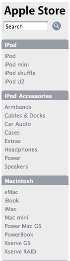
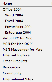
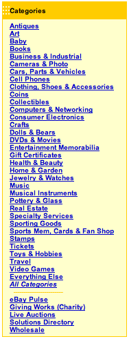
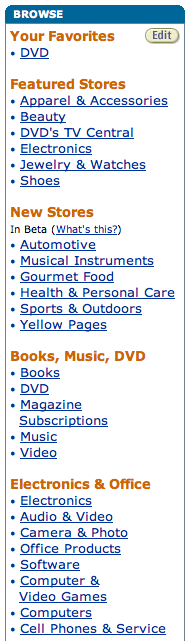
Or do you start to stack them down the left side of the page? If so, should they be in their own frame, so that they always stay visible as you scroll down the page?
| Home |
| About us |
| Contact us |
| Legalisms |
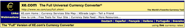
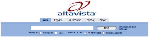
A non-scrolling frame has its own awkwardness, of course, and seems to have fallen out of favor with many designers. But a list of buttons down the left side is almost a universal solution these days, as shown in these (half-size) examples (none of which are in non-scrolling frames, by the way):

The same issues apply to navigation bars at the top of the page, as shown in these examples (see, two lines!):


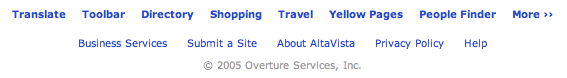
Running out of room everywhere else, sites are beginning to wrestle with navigation at the bottom of the page:

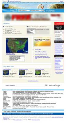 But for a look at some really exciting navigation issues, let's
try weather.com (click here to go to a full-size version
or to the actual
page):
But for a look at some really exciting navigation issues, let's
try weather.com (click here to go to a full-size version
or to the actual
page):
Now there's some visual complication! You've got (roughly, from the top) blue underlined links, button links, a data-entry box, a pop-up requiring a 'go' button, a reversed underlined page link, radio buttons, a selection list, a clickable image, blue underlined links, another selection list, another date-entry box with its 'go' button, blue underlined links in an unnumbered list, blue underlined links with clickable images, yet more blue underlined links, a data-entry search box with yet another 'go' button, and bottom navigation using many black underlined links, reversed underlined links, and blue underlined (though not in blue, just to be different) links. Whew.
This shows what we've grown accustomed to as 'conventions', even for links to other pages: traditional (and now almost quaint) blue underlined text, buttons, images, and text of varying colors and underlining. You can tout your ability to do CSS and 'handcoding' all you want, but if you can't decide what a link should look like better than that, I don't want to hear about it.
Oddly enough, we've gotten so used to information overload that (most of the time) we can focus on what's important to us, even in a page as complex as this one. On the other hand, why should we have to? Why does every page have to have access to every other possible page in the site? By my count, there are links to over one hundred other internal pages on that one weather.com page. That's like putting the entire table of contents on every page of a book, just in case...


If the two header bars shown above, after being carefully introduced on an earlier page, were merely used as links at the bottom to 'jump' pages carrying a list of the 80-odd other pages they represent, not only would it save a lot of page room (hey, every bit helps when you're paying for transmission or waiting for bandwidth), but reduce eye irritation immensely.
Okay, we're looked at several 'professional' web layouts, and seen a few constants:
- navigation is difficult to keep simple while still allowing access to a broad and deep site
- navigation can (though perhaps it shouldn't) be found all across a given page
- navigation tools have lost whatever conventions the web started with, and can look like anything on a page
My advice for internavigation and intranavigation tools is this: determine your internal conventions early and stick to them.
Some rules, for those who like rules:
- distinguish between internavigation tools (you're going to some
other site entirely if you click here or
click www.somewhere-else.com) and
intranavigation tools (you're going to some other page on this site
if you click here and you're going
somewhere else on this page if you click here) on the landing page (and as many 'early'
pages as necessary to cover all eventualities) and never vary them
- if blue underlined text defines a link for you, make it so all the time, design be damned
- if you must break that rule, announce it some other way: "Click here to go Somewhere Else"
- keep buttons to themselves
- don't sprinkle navigation all across the page; the user got used to where you put it on the early landing pages
- don't make the user scroll a long way up and down (or side to side) to get to the buttons; if your pages have to be really long to fit your content, park an occasional Top button that takes them back to the tool area
- make buttons look like buttons; most HTML applications have button generators, but you can make your own in GIMP or Photoshop just as easily, with better results. Using words (even if defined early on as above) as buttons without some 'button-ness' to them only makes the user work harder; the standard words-in-a-line solution like this one is better than nothing, but just barely (I think it's lazy, but it might be necessary in a big site with constant changes):
- you can't have too many ways for the user to get where they want to go; if you have images next to linked text, link the images, too. (Banging away at an image that represents where they want to go, with nothing happening as a result, sends users elsewhere in a hurry.) But if you have text next to linked images, be sure to link some portion of the text as well; some users like images and some users like text, so give them both.
- put a "Click here to go to the beautiful and helpful map of this site" link or button (and make sure the user knows what it is if you use a button; a cute little map image is fine if you defined it earlier) on every page. A properly designed site map will quickly solve any user confusion and reduce the number of navigational tools you need on every page
So, you hate rules. If you're not going to follow any of my rules, make damn sure you define your links early on: "Links on this site are indicated by flashing green elves and/or tiny red bullets and/or photos of my dog". (Make sure you have good behavior tracking software installed, too, so you can watch users departing your site at high velocity...) If you're creating some totally 'personal' site, it may not matter. If you expect users to enjoy using your site, buy things from you, tell their friends about you (you have heard of viral marketing, right?), and come back again, better come up with your own rules that work. Remember, all anyone expects of your site is exactly what they want to do, not what your design wants them to do. Make it easy for them.
Top of page, just because I said you should.
If you've gotten this far, you're probably wondering about the title of this month's column. Besides being a swipe of a line from one of my favorite speeches in Shakespeare ("...for Harry, England, and Saint George!" from the battlefield scene in Henry V), it recognizes two people, either of whom ought to be the patron saint of web designers, Prince Henry the Navigator and St. Brendan the Navigator. (Are we seeing a navigation theme here?)
 Prince Henry, the son of the King of Portugal in the
fifteenth century, organized and bankrolled numerous expeditions which
expanded both Portuguese influence and maritime knowledge along the western
edge of Africa, ultimately leading to Bartolomeu Dia's voyage at the start
of the sixteenth century that finally rounded the Cape of Good Hope and
opened the ocean route to the riches of the East.
Prince Henry, the son of the King of Portugal in the
fifteenth century, organized and bankrolled numerous expeditions which
expanded both Portuguese influence and maritime knowledge along the western
edge of Africa, ultimately leading to Bartolomeu Dia's voyage at the start
of the sixteenth century that finally rounded the Cape of Good Hope and
opened the ocean route to the riches of the East.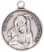 St. Brendan was, if the stories are true (and if you
think they're not, I suggest you have some more whisky until you do), the
first person to reach the Western Hemisphere from Europe in the sixth
century (well before that other guy whose Day we celebrate merely for doing
it a thousand years later), traveling west in a hide boat from Ireland. He
is the patron saint of navigators, and with the right PR behind him
might well have become the patron saint of the internet instead of this
guy:
St. Brendan was, if the stories are true (and if you
think they're not, I suggest you have some more whisky until you do), the
first person to reach the Western Hemisphere from Europe in the sixth
century (well before that other guy whose Day we celebrate merely for doing
it a thousand years later), traveling west in a hide boat from Ireland. He
is the patron saint of navigators, and with the right PR behind him
might well have become the patron saint of the internet instead of this
guy: St. Isidore, the front-runner in the race to become the
saint's medal on the dashboard of the Web,
beating out the Archangel Gabriel and St. Bernadine of Siena (the patron
saint of public relations) and St. Rita of Cascia (the patron saint of
impossible causes) in a proposal to the Vatican by an all-Italian internet organization. (Go
figure why they like some Italian guy over a nice Irish boy like St.
Brendan...)
St. Isidore, the front-runner in the race to become the
saint's medal on the dashboard of the Web,
beating out the Archangel Gabriel and St. Bernadine of Siena (the patron
saint of public relations) and St. Rita of Cascia (the patron saint of
impossible causes) in a proposal to the Vatican by an all-Italian internet organization. (Go
figure why they like some Italian guy over a nice Irish boy like St.
Brendan...)
No matter who ends up being the patron saint of your internet, if you want me to write about some specific aspect of design, you gotta email me and let me know.
![[BIO]](../gx/authors/seymour.jpg)
I started doing graphic design in junior high school, when it was still the Dark Ages of technology. Bill Gates and Steve Jobs were both eleven years old, and the state of the art was typing copy on Gestetner masters. I've worked on every new technology since, but I still own an X-acto knife and know how to use it.
I've been a freelancer, and worked in advertising agencies, printing companies, publishing houses, and marketing organizations in major corporations. I also did a dozen years [1985-1997] at Apple Computer; my first Macintosh was a Lisa with an astounding 1MB of memory, and my current one is a Cube with a flat screen.
I've had a website up since 1997, and created my latest one in 2004. I'm still, painfully, learning how web design is different from, but not necessarily better than, print.
